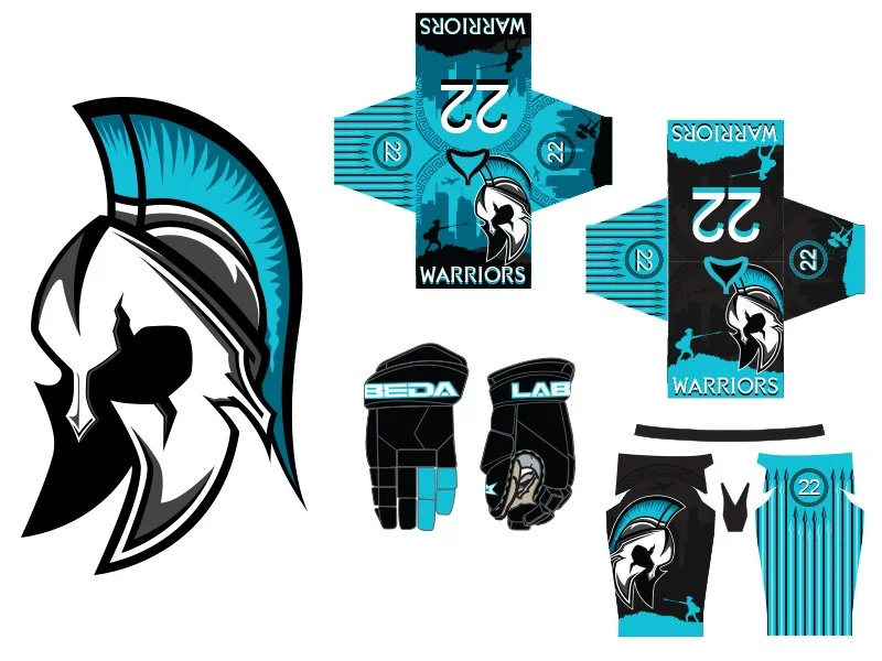
Task at hand: Update the Windy City Warriors roller hockey tournament team’s logo so they’re look will match their talent.
How did we get here? After a lot of discussions with the team and the person who runs everything, they all collectively wanted something extremely bold with a lot of contrast that will look good as a stand alone logo for shirts and hats, but also read well on jerseys, pants and gloves. Using a color palette decided on by the team, I came up with a banged up warrior helmet similar to a spartan helmet which they all really wanted to be the base for the design.